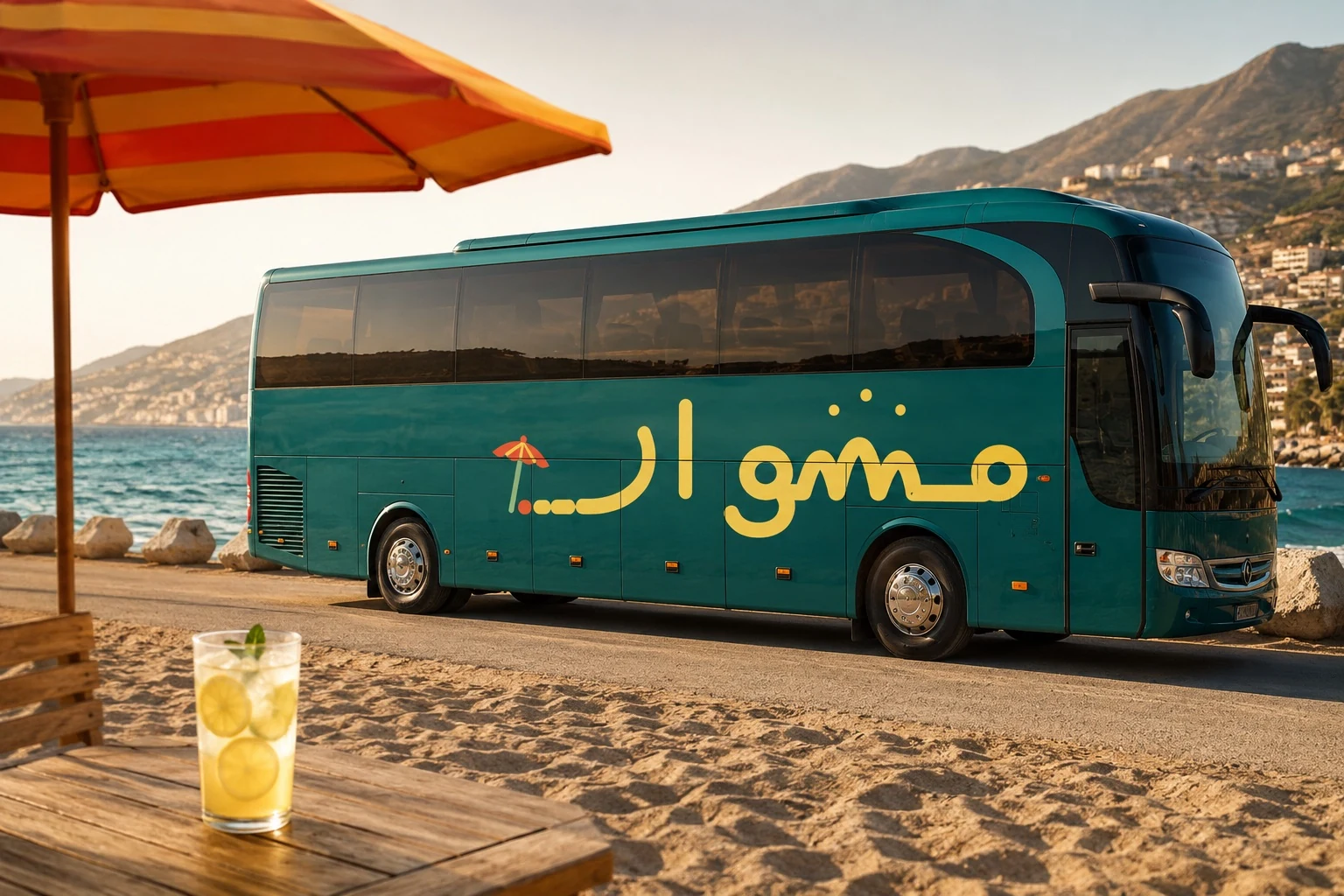
Mishwar identity design
and the trip booking experience.
A case study on how we brought together the visual identity and the user experience into a single flow that shows dates, prices and seats, then prepares the booking request over WhatsApp.
See the booking experienceFrom scattered details to a clear booking experience
Mishwar's trip details were scattered across posts and chat threads, and every customer had to ask about the date, the price, the route and the seats before deciding. So we designed the identity and the booking experience as one system that makes the trip clear and sends the request in a few steps.
Show the trip programme, the price, the route and the available seats in one place that is easy to read.
Brand strategy, visual identity design, user experience design, and building an interactive booking prototype.
A distinctive local identity and a light digital product that organises the information and passes the booking request to WhatsApp.
A logo, a colour system and usage rules, alongside a trip calendar and a booking experience you can test.
We put trip details and the booking request on one screen
The prototype inside the phone is live and open to try. It shows two months of trips, the details of each destination, the price and the seats left. When someone picks a trip, the system builds a ready WhatsApp message carrying the booking details.
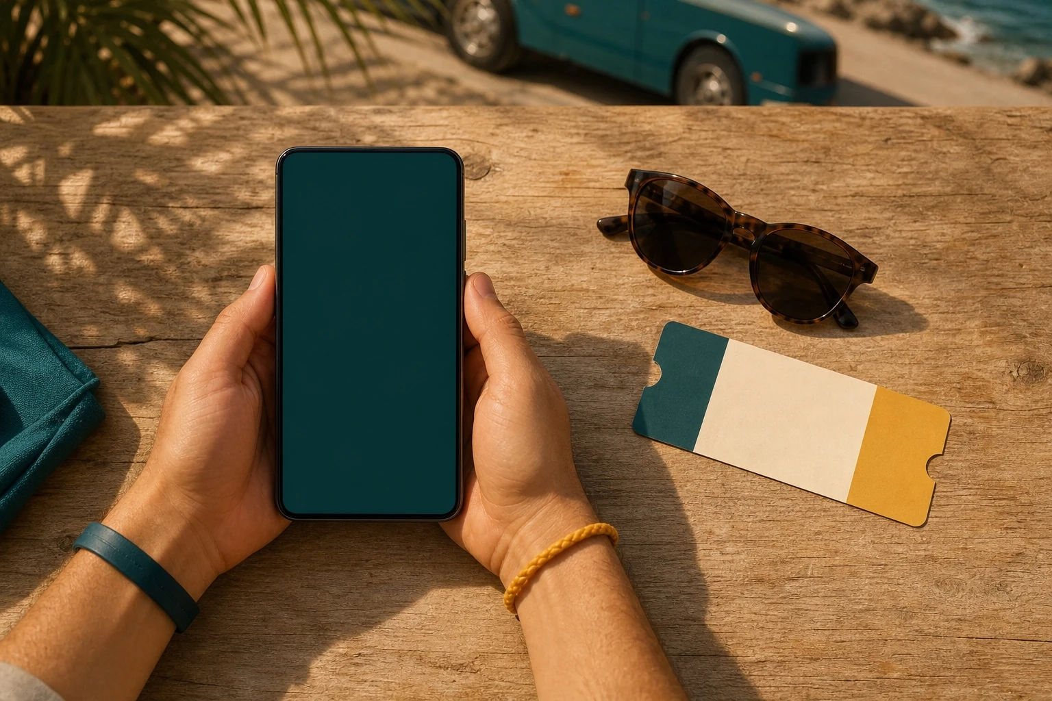
The phone screen shows the real Mishwar calendar running from the prototype itself, not an interface drawn into the photo.
The calendar shows which days are open and which are full, and each card gathers the route, the price and the seats left.
An «only 4 seats left» notice appears automatically, while a full day sends the user to the waiting list.
The whole experience runs in a single HTML page; the application logic is about 23 KB, with no external requests after load.
We designed the booking around the user in Syria
Internet connections can be weak, online payment gateways are not reliably available, and conversation is still the main channel for building trust. So we chose a light page, local payment options and a ready WhatsApp message rather than forcing a new account and a payment path that does not fit the reality on the ground.
The user picks Sham Cash for a direct transfer or Al-Haram to pay at a branch before sending the request.
We ask for no new account: the chosen trip turns into a clear message that reaches the operator, who completes the booking.
After the first load, the fonts, the data, the graphics and the interaction logic all stay inside the same file.
The calendar updates its dates and Arabic month names, so the prototype stays testable as time passes.
We drew «mishwar» as a road that leads to a destination
We started from the name itself, drawing the wordmark by hand instead of setting a ready typeface or reaching for a conventional travel symbol. The letters join into one path that starts at a point and ends at a destination, so the meaning of «mishwar» — an outing with a destination — becomes part of the mark.
We avoided the usual travel symbols
A visual audit of travel brands showed the same symbols repeating: the aeroplane, the globe, the map pin, the suitcase and the compass. We ruled them out and built Mishwar's character from the name, the road and the destination, so the brand is easier to remember and less like its competitors.
We tested the colours on the mark and in use
We tried 24 colour sets on the main wordmark and on the badge — 48 visual tests in all. Three samples here represent different directions, followed by the approved set, chosen after comparing legibility, contrast and how the brand holds up on screen and in print.
The final set brings teal, lemon yellow and earthy orange together on a light sand background. These colours read clearly and feel local without slipping into stock tourism imagery.
Yellow on the teal background carries the main interfaces, while teal lettering on sand carries print and quieter spaces.
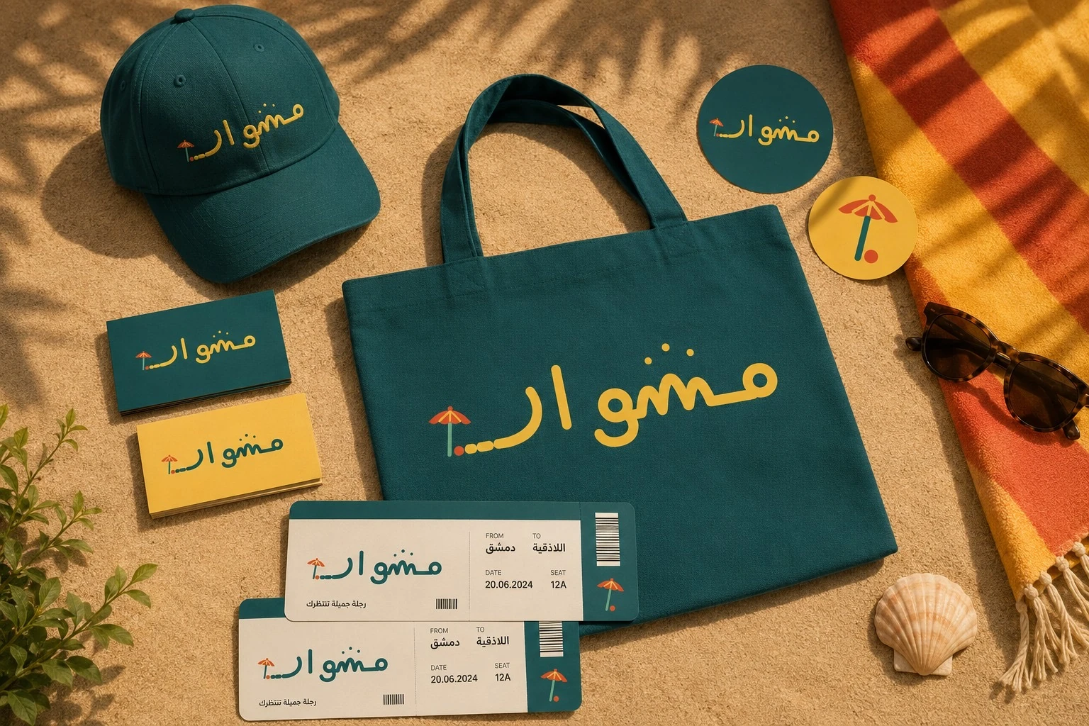
Mock-ups showing the logo and the colours on fabric, travel cards and small printed items.
We turned the mark's language into booking components
We did not stop at placing the logo in the interface. The same road idea shows the stops along the trip: a continuous line, dashed segments, and a bend that ends in an orange arrival point. That makes the booking experience a natural extension of the identity.
A design structure that extends with new programmes
The identity does not stop at the logo. We drew five icons to classify destination types, alongside components and usage rules that can be reused on future trips and screens without losing consistency.
Note: we built the design system to grow out of the approved logo, and documented the rules that hold it together when new components are added.
We delivered a usable identity and a working prototype
The handover covered print-ready and web-ready identity files, usage rules that hold the work together, a design system built to grow, and an interactive booking prototype showing how the brand turns into a digital product.
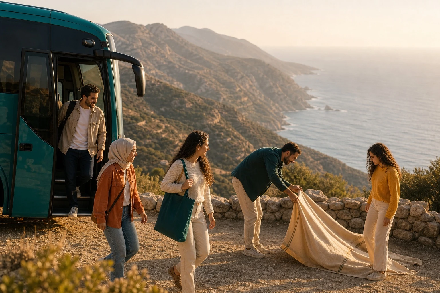
The value shows when someone moves from searching and repeated questions to a clear decision and a ready booking request.
If your operations run on repeated questions and manual work, digitisation can cut out steps and improve the customer experience.
Talk to us about digitising your project ↖